Sydney living often means learning to love a compact floor plan. Before you knock out walls or purge half your belongings, consider what a clever paint scheme can do. Colour psychology explores how our brains interpret hue, light and contrast, and the right choices can visually stretch a room, raise a ceiling or pull a wall back a step. If you ever reach the stage where you need hands-on help, professional painting services in Sydney can turn careful planning into crisp, even coverage—but first, let’s look at what you can achieve with smart colour thinking.
Why Colour Psychology Matters in Tight Sydney Spaces
Open-plan terraces in Newtown, new builds in Zetland and heritage studios in Potts Point all share one thing: square metres are at a premium. Our eyes rely on light, contrast and temperature cues to judge distance. Light-reflective colours bounce more illumination around, cool hues feel further away, and continuous tones trick the brain into perceiving continuity. Harnessing these principles can:
- reduce the “corridor” feel of long narrow rooms
- make low ceilings appear less oppressive
- divert attention from awkward nib walls or service risers
- create cosy zones without making the whole apartment feel dark
That means fewer renovations, lower strata approval hurdles and a more enjoyable space day to day.
Understand Your Light: North, South, East or West?
Sydney’s latitude gives apartments distinct light personalities:
- North-facing rooms bathe in warm, consistent light—great for cooler paints without feeling icy.
- South-facing rooms often look subdued; warm neutrals can counter the greyness.
- East-facing spaces glow in the morning and cool by afternoon—balanced mid-tones work well.
- West-facing living areas cop harsh afternoon sun; soft greens or muted blues can temper the glare.
Observe your unit over a full day, phone in hand to note where shadows land. This will guide which psychological tricks pay off and which may fall flat.
Five Colour Strategies to Visually Expand a Room
Below is a quick comparison table, followed by deeper explanations of each tactic.
| Colour Tactic | Psychological Effect | Best Used For | Watch-outs |
| High LRV neutrals | Reflect more light, walls recede | Dark hallways, windowless corners | Can feel sterile if everything is stark white |
| Cool receding hues | Objects appear further away | Feature walls at the narrow end of a room | Overuse can feel chilly in south-facing units |
| Monochromatic palette | Fewer visual breaks = larger field | Studio apartments with many nooks | Needs texture (rugs, timber) for depth |
| Strategic accent wall | Depth cue draws eye outward | Short walls in a long room | Too dark and the wall “jumps forward” |
| Gloss or semi-gloss finish | Light bounce adds dimension | Doors, trim, low ceilings needing lift | High gloss on rough plaster highlights flaws |
High Light-Reflectance Neutrals
Paint tins list an LRV—light reflectance value—on the label. Shades above 60% (think crisp whites, soft creams) bounce daylight around like a second window. In a ground-floor Surry Hills flat where natural light is a luxury, choosing a warm white for walls and ceilings can double perceived brightness. Add colour through art and cushions so the apartment still has personality.
Cool Receding Hues
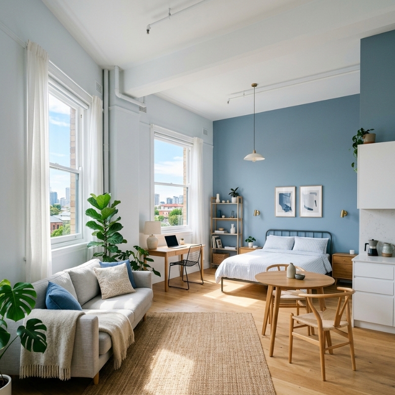
Cool colours—bluish greys, muted sea greens—appear to step back from the viewer. Painting the far wall of a narrow Ultimo living room in a dusty blue lets the eye “travel” further, easing the tunnel effect. Keep adjacent walls lighter to enhance the contrast.
Monochromatic Palettes
Sticking to one hue in varied strengths prevents the “striping” you see when each surface changes colour. Imagine a Paddington terrace bedroom where walls, skirts and even built-ins wear gentle sage variations; the lines blur, and the limited space feels seamless rather than boxed in.
Accent Walls for Depth
Done right, a single accent creates a focal point that elongates the room. Choose a wall you naturally face—behind a bedhead or sofa—not the side wall you view at an angle. Make sure the colour sits two or three tones deeper, not ten shades darker, or that wall may visually advance instead of recede.
Gloss and Sheen Placement
Flat or matt paints absorb light, giving depth but also shrinking a room. Semi-gloss on doors, window trims and even ceilings can lift height because reflective surfaces catch the eye upward. In older Federation apartments where ceilings hit 2.6 m or less, this subtle lift feels surprisingly roomy.
Common Mistakes That Undo the Illusion
- Painting every surface a high-gloss white—overkill leads to glare, not spaciousness.
- Ignoring undertones—cool whites with blue bases can look clinical under warm LED lighting.
- Chopping walls with stark feature strips—contrast lines break continuity, fragmenting space.
- Forgetting furniture—dark bulky sofas or bookcases can defeat the best paint plan.
For more nuance on tone choices, see our earlier article on the impact of wall colour on home ambience.
Local Factors: Strata Rules and Heritage Units
Strata bylaws across Sydney often allow owners to repaint internal walls without permission, but common property surfaces—balcony balustrades, front doors—usually need committee sign-off. Heritage-listed apartments in suburbs like Millers Point must adhere to approved palettes. Check the NSW Heritage paint guide or your strata plan before finalising colours. The state’s own NSW Apartment Design Guide also stresses light-coloured finishes to maximise daylight in compact dwellings—a handy reference if you face committee questions.
Quick Prep Checklist Before You Pick Up a Brush
- Photograph each wall in morning and afternoon light.
- Patch hairline cracks and sand flaking areas so sheen finishes don’t highlight defects.
- Prime over dark existing colours—saves coats later.
- Test pot swatches on at least two walls; observe for 48 hours.
- Confirm furniture placement so accent walls land behind statement pieces, not clutter.
When a Professional Eye Helps
DIY painting can be rewarding, yet small apartments magnify brush marks, lap lines and sheen inconsistencies because surfaces are so close to the viewer. If you spot water damage, tricky cornices, or simply want a flawless finish without shifting all your furniture twice, calling a licensed painter keeps the momentum (and your weekends) intact.
FAQs
1. Do I need strata approval to repaint inside my apartment?
Usually no—internal walls are the lot owner’s responsibility. However, check your strata bylaws if you plan to change external-facing surfaces such as balcony ceilings or entrance doors.
2. Which paint finish hides surface imperfections best?
A low-sheen or matt finish absorbs light, masking dents better than gloss. In tight units, balance this with paler colours and strategic semi-gloss trims to avoid dullness.
3. Can dark colours ever work in a small room?
Yes, when used intentionally. A deep charcoal feature wall behind open shelving can create depth, while keeping adjacent walls light prevents the room closing in.
4. How long should I wait between coats in humid Sydney weather?
Most acrylic paints recommend two hours, but high humidity can extend drying. If in doubt, wait four hours or use a fan to circulate air—never rush; tacky paint shows every brush mark.
5. Is it worth buying low-VOC paint for a studio apartment?
Absolutely. Smaller volumes of air mean fumes concentrate quickly. Low-VOC or zero-VOC options reduce odour and are better for indoor air quality, especially if you sleep in the same space.
Final Thoughts
With a keen eye on light direction, colour temperature and finish, even a 40 m² Sydney apartment can feel refreshing and open. Experiment on a small scale, keep undertones consistent and remember that well-chosen accents can add personality without stealing space. And when precision or time pressure looms, professional painters are only a call away to bring those colour psychology insights to life.