Get a Free Quote Today!
Transform your space with expert painting services. Fill out the form, and our team will get back to you with a competitive quote—hassle-free and with no obligation!

Walking into a commercial space, the first thing most people notice isn’t the furniture or layout—it’s the colour on the walls. Whether it’s a bright retail store or a corporate office, commercial paint colours set the tone for customer perception from the moment they enter. The hues you choose can shape how clients and customers view your professionalism, personality, and brand.
But why does this matter so much? Colours evoke emotions, set moods, and communicate professionalism—or the lack of it. In commercial spaces where first impressions can make or break a deal, this becomes crucial. This article explores how commercial paint colours affect first impressions, what pitfalls to avoid, and how to choose shades that reflect your brand’s personality.
First impressions are formed in mere seconds; once made, they’re hard to reverse. In a competitive market like Sydney, businesses need every edge.
Imagine stepping into a law firm with peeling paint and clashing colours. It doesn’t exactly scream competence, does it? On the other hand, a modern, freshly painted space in cohesive tones instantly builds confidence.
That moment a customer walks through the door might determine if they stay or turn around. With increasing options available, no business can afford to lose customers over something as fixable as aesthetics.
That’s why investing in your space’s appearance is more than just aesthetic—it’s strategic.
Bad colour choices don’t just look dodgy—they can cost you customers. While a hot pink might be fine for a nail salon, it could feel completely out of place in a law office.
Let’s say you choose a bold red for a quiet counselling office—it could raise tension rather than soothe it. Your space should make people feel comfortable, not confused.
It also signals how you care about your business. When colours are thoughtfully selected, customers pick up on the professionalism and effort put into curating the environment.
One example of getting it right is understanding why regular repainting matters for commercial properties. Staying on top of trends and wear-and-tear keeps your brand looking fresh.
Even seasonal refreshes can help reset your business atmosphere and keep it relevant.
Colours aren’t just visual—they’re psychological. Each shade can influence how people feel, behave, and even how long they stay.
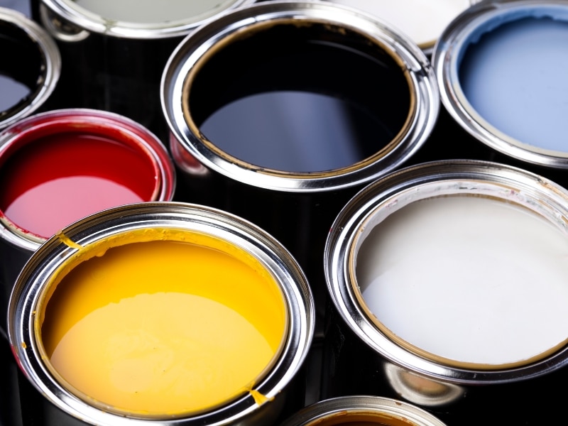
When used well, these colours support the mood you want to create. But misused, they can send conflicting signals.
Studies show that the ways colour impacts how customers view commercial environments are more than just theory. They’re backed by decades of behavioural research. Choosing the wrong tone for your audience can actually push them away.
Colour psychology is especially critical in high-stakes commercial zones like medical clinics or financial institutions, where trust and calmness need to be reinforced subtly.
Retail settings are all about creating an inviting, dynamic experience. But this doesn’t mean going wild with colour.
Here’s a quick comparison of paint colours by effect in retail spaces:
| Colour | Psychological Impact | Best For |
| Blue | Trust, calmness | Financial services, wellness |
| Red | Urgency, energy | Sales sections, food service |
| Green | Balance, harmony | Natural or eco brands |
| Yellow | Cheerfulness | Kids’ sections, fun zones |
It’s also wise to consider how various shades complement product displays, lighting schemes, and flooring materials. Overly saturated colours can fight with your signage or branding.
For long-term success, it’s also worth knowing how different weather conditions impact painting outcomes, especially for exterior retail spaces exposed to Sydney’s shifting climate.
Lighting can completely change how paint looks. Natural light, LED fixtures, and shadows all alter how colour reads in a space.
If you choose a grey-blue paint in the showroom, it might turn icy under fluorescent lighting. Always test your colours under the exact lighting conditions your space will use.
A clever tip? Paint sample patches on multiple walls and view them at different times of day. This helps you avoid surprises once the job’s done.
Choosing colours isn’t about personal preference—it’s about brand identity and customer perception. The shades you use should echo your business values and message.

Brand-consistent colours enhance recall and loyalty. For example, a tech startup might lean towards modern greys and electric blues, while a wellness spa opts for earth tones and pastels.
If you’re struggling to match colour to identity, consider choosing effective commercial paint colours for your business. Professionals can help align visual appeal with psychological impact.
Business owners often underestimate how deeply colour strategy impacts customer behaviour, productivity, and brand loyalty. Whether you’re launching a startup or refreshing a long-standing firm, strategic colour decisions shape perception.
Businesses in Sydney face stiff competition, and even subtle touches can tip the balance. Your space should look like it belongs to a leader in your field, not an afterthought.
It’s not just about paint—it’s about experience. A cohesive colour plan integrates brand values, design preferences, and practical considerations like lighting and layout.
First impressions are hard to change and often built in seconds. With the right commercial paint colours, you can welcome visitors with confidence, communicate professionalism, and support your brand story.
From understanding colour psychology to testing under proper lighting, every choice matters. The right hues can make a space more inviting, boost morale, and help you stand out.
So don’t settle for “good enough.” Instead, connect with the team at Magic Touch Painting for tailored recommendations to create a space that speaks for itself—before you even say a word.